


Description
In an article published just this year by data and statistics enthusiast Flo Tausend, Flo outlines several examples of how data is skewed to serve a preferred story (Tausend, 2020). The scenarios he describes includes “Truncated Y-axis”, meaning that in a bar-graph model, the Y axis may not be set to start at Zero. It may be set to start where the graph begins changing more drastically, as demonstrated in the visual below.
Figure 1
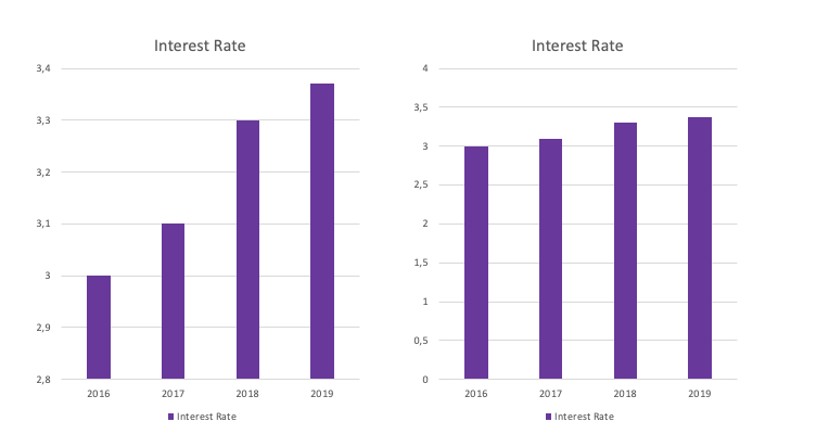
When the graph maker started the graph at 2.8, the change looked more drastic than if it was started at zero. This is an exaggeration. It’d be more ethical to comply with a standard of a zero’d Y axis, which would still allow an analyst to speak into a subtle (but existing) change.
In another example, Tausend explains how those in denial over climate change often back their statements by looking at a specific data set between the years 2000 and 2013. This is referred to “Cherry-picking” or discarding unfavorable data. See Figure 2 versus Figure 3.
Figure 2
Temperature Anomaly 2002–2013 (Source: NASA)
Figure 3
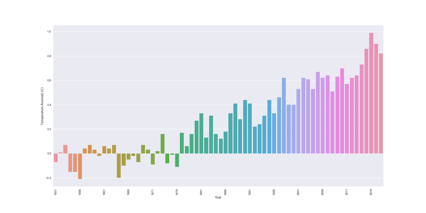
Temperature Anomaly Complete (Source: NASA)
In Figure 3, it certainly can be seen that climate has changed drastically over the last few decades; however, it’s intentionally disregarded by those who believe they have something to gain from climate change not being an issue. The full picture must be made available, every time.
In a study published by the American Accounting Association more than a decade ago, a group of graph-makers or “decision-makers” was examined before and after a training session (Raschke & Steinbart, 2008). The purpose was to see if training a group of “decision-makers” around the principles of graph-making would reduce the likelihood of decision-making biases when presenting data. The results of the experiment showed that there was no significant change. Even when misrepresentation was defined, graph-makers chose to tell the story they preferred.
Ultimately, this indicates that ethics in statistics and data presentation is critical and that organizations must have compliance checks in place to make sure representations of data are unbiased. Otherwise, stories like those of Diederik Stapel, which we read of in our text are more likely. When data is available, it is taunting to present it in a way that supports an existing feeling; however, stating the facts as plainly as possible is the only way that effective action can be taken on a statistic.
Tausend, F. (2020, April 17). Misleading With Data & Statistics. Retrieved May 15, 2020, from https://towardsdatascience.com/misleading-with-data-statistics-c6d506bdb9cf (Links to an external site.)
Raschke, R. L., & Steinbart, P. J. (2008, September 01). Mitigating the Effects of Misleading Graphs on Decisions by Educating Users about the Principles of Graph Design. Retrieved May 15, 2020, from https://meridian.allenpress.com/jis/article-abstract/22/2/23/75334/Mitigating-the-Effects-of-Misleading-Graphs-on?redirectedFrom=fulltext
Second post belo
There have been numerous reports relating the Covid 19 virus and the seasonal flu in percentages and deaths. This prompted my search for information on the seasonal flu in the United States. Below is a graph that illustrates the positive tested cases of the flu on a bar graph.
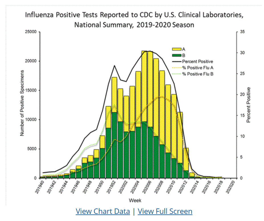
Figure 1 - Influenza Positive Tests (Center for Disease Control and Prevention, 2020).
According to (OpenStax, 2019), the data is quantitative discrete data because it is numerical and can only be in the form of whole number (OpenStax, 2019). For example, a person cannot be half positive for the flu; the count would be 1 person for a positive or negative result. The graph itself is not misleading; however, one would want to read the corresponding data on the table to determine the actual amount of individuals tested so that the information on the graph could be understood more thoroughly or if one was comparing the figures to other viruses for percentage of cases or percentage of positives. The data is below:
Figure 2 - Influenza Data (Center for Disease Control and Prevention, 2020)
For example, the week of 201940 reflects 1.3% positive cases but one would want to know of how many individuals were tested to arrive at that percentage, which the table reflects 19,851. Due to the ever-changing number of individuals tested compared to positives, the percentage of positives to tests will always be changing.
References
Center for Disease Control and Prevention. (2020).Weekly U.S. Influenza Surveillance Report. Retrieved from https://www.cdc.gov/flu/weekly/index.htm
OpenStax. (2019). Introductory statistics. CC BY-SA. Houston, TX: OpenStax College. Retrieved from

Explanation & Answer

I have finished writing the responses to the discussion posts 😎. Let me know if you need any edits
Responses
Response to First Post
Data presentation is a crucial aspect of the contemporary world because many people
rely on data to make decisions. However, the problem of lack of ethics in the data undermines
the validity of the data presented to people (Gelman & Loken, 2014). Indeed, the issue of
truncating bar charts...
Review
Review


